


 A Learner outside her home in Empindweni village in Mqanduli outside Mthatha on the first day of the opening of coastal schools on 19 January 2022.Photo:Felix Dlangamandla/Daily Maverick
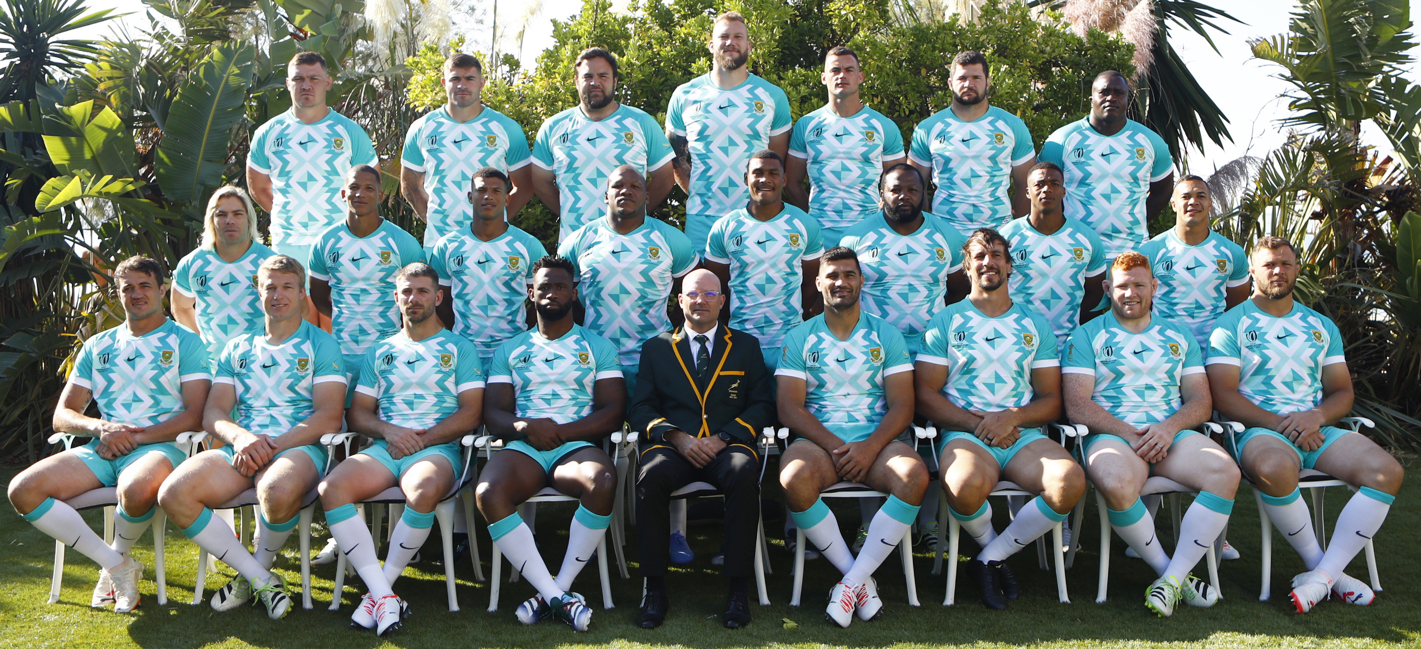
Listen, it’s not a huge issue in our lives. There are more important subjects out there. I know. But may I just please, very briefly, in passing, register an objection to the Boks’ kit? Anybody who watched the match against Scotland will have noticed the team is wearing a kit that bears a terrible resemblance to mouthwash.
My podcast interlocutor, Mark Barnes, speculates on our next podcast, to be published on Wednesday, 13 September, that the real reason we won against the Scottish was because they spent the entire first half giggling at what the Boks were wearing.
The colour, because it’s so awful, naturally has a hyperbolic name. The official colour description is “Hyper Jade”. There is a type of jade, the semiprecious stone, which does in fact look like this mouthwash. But jade comes in a variety of different colours ranging from yellow to red, so the kit looks nothing like a lot of jade. Hence, if you follow my logic, it is impossible to be an enhanced version of jade.
The most treasured jade — and here is a great irony — is very close to the dark green colour of the Boks’ No 1 kit, which is the traditional green and gold. But the Boks will only be playing in two matches in that kit in the very likely event that they make it all the way to the final.
There is also a No 3 kit, which is, god save us, also Hyper Jade — just a little bit less of it. So why would the designers of the Boks’ kit choose such an awful colour? Political correctness of course.
Hyper Jade (I think you have to capitalise the colour because it’s just so powerhouse) is designed to help people who are colour blind distinguish between the teams. I am not making this up. If you have one team playing in dark blue — as the Scots do — and one team in dark green, it can be difficult for colour blind people to follow.
Read more: Springboks and All Blacks can never meet again in their primary kit – new World Rugby regulations
The problem with the kit is not, in my humble view, the desire to take account of the physical shortcomings of the visually impaired — I have enough shortcomings myself to be strongly in favour of advantaging the impaired. It’s just that colour blindness is not “blindness” in any sense; this is a popular myth. Of all the handicaps out there, colour-“blind” people are arguably the least “disadvantaged”.
Red-green colour-“blindness” — the most common kind — affects about 9% of male Caucasians and about 4% of Africans, but the degree varies widely. It’s caused by a defect in the X chromosome. Since women have two X chromosomes, one typically makes up for the other, so very few women are colour blind. Men only have a single X chromosome, so if it’s defective, they are stuffed. It is hereditary and it varies in intensity. It shows up on those circular cards with blobs that your eye doctor might show you, asking you to identify letters or numbers.
Many of my colleagues are very in favour of the Boks’ kit — and why not, particularly since nobody wants to seem like they don’t care about the visually impaired. They do make several interesting points in favour of the kit. Hyper Jade was pioneered in SA as a sports kit by Orlando Pirates and many homesteads in the rural areas are now painted in that colour. It is also the colour of one of the sponsors, FNB.
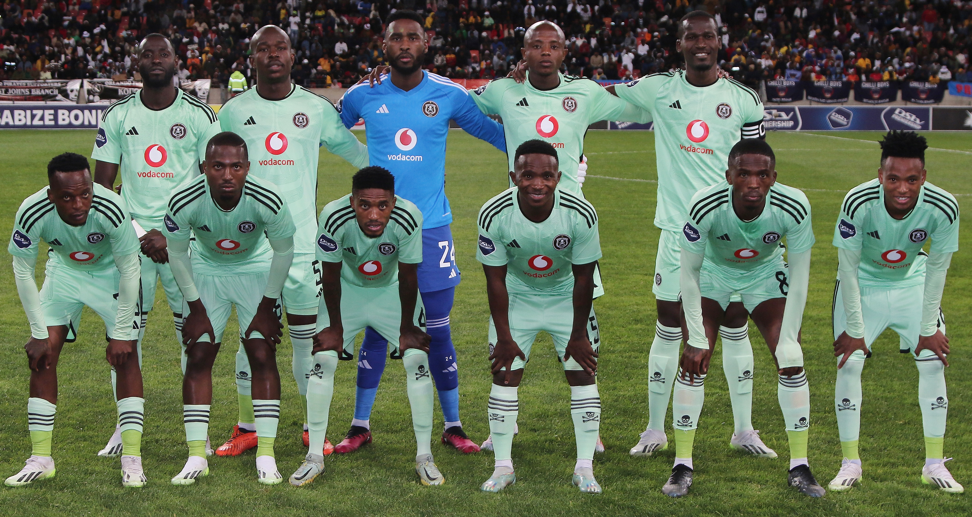 Hyper Jade was pioneered in SA as a sports kit by Orlando Pirates. (Photo: Richard Huggard / Gallo Images)
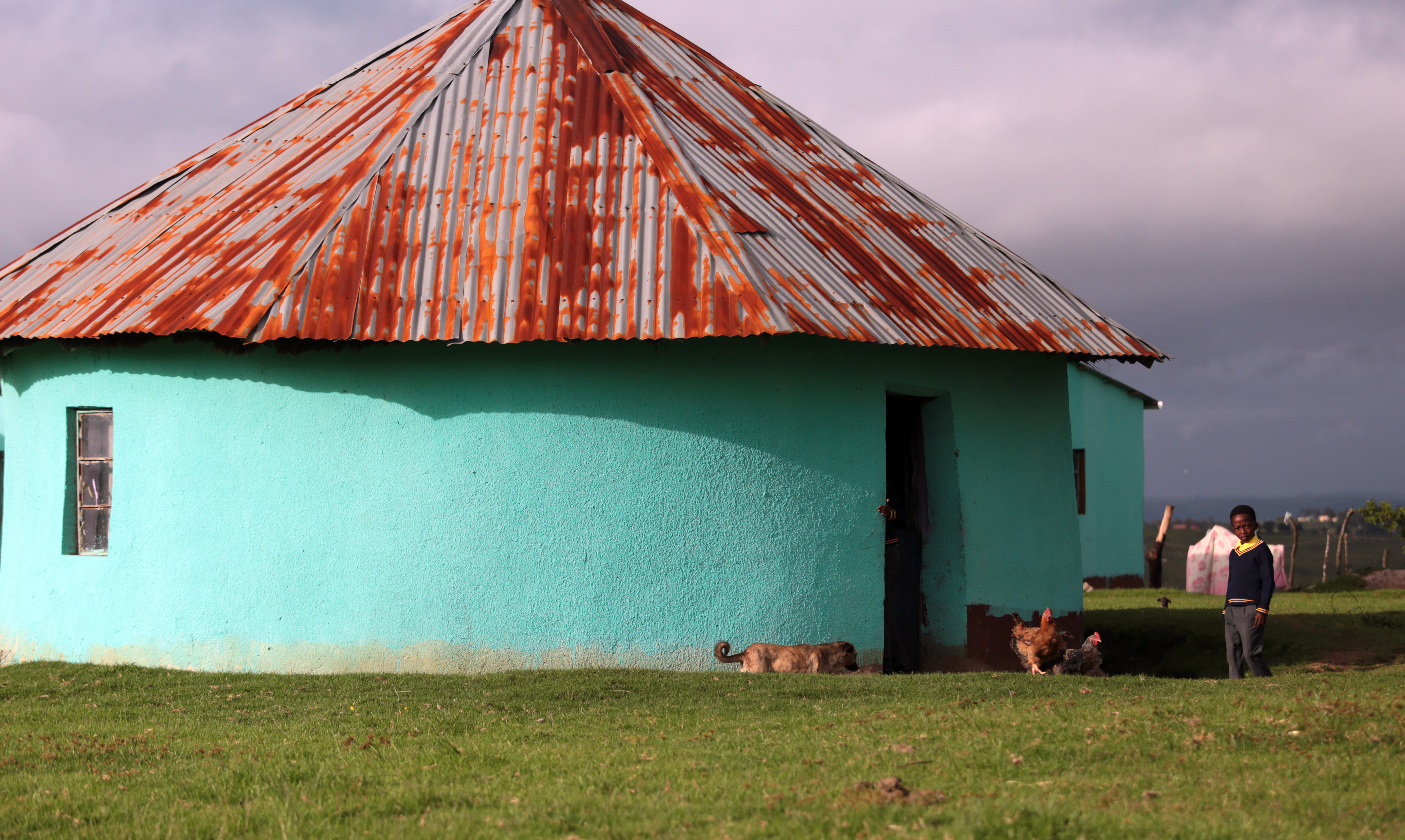 Many homesteads in rural areas are now painted in Orlando Pirates’ Hyper Jade kit colour. Photo: Felix Dlangamandla / Daily Maverick)
But here is a problem; one of the two colours of Checkers’ 60/60 logo is, you guessed it, Hyper Jade, so Checkers is getting a bit of a free sponsorship ride. It is also far from the colours of any of the other 31 sub-sponsors, most notably MTN, the official jersey sponsor.
Now for a devious twist. Nike is the apparel sponsor and Nike has released takkies over the past few years which feature — yes! — Hyper Jade. I, for one, would like to know how much influence they had over the choice of colour. I suspect something nefarious. Just saying.
This whole issue turns on branding. Ask any marketing guru about the importance of colour and you will get a mouthful; it’s absolutely crucial to the identity of the product. People cringing over the Springbok kit are doing so, I suspect, because instinctively they recognise that abandoning your brand colour reduces all the great strengths that brands build: identity, uniqueness and chronology, to name just a few.
And there is one other thing: you can buy EnChroma glasses to rectify colour blindness for around R200, so it’s not like our colour blind brethren are absolutely helpless. I’m not sure how well they work, but Stage Four cancer this is not.
As I say, it’s not a huge issue: I don’t really care that much about what the Boks wear; I’ll support them in any colour.
It does make me a bit sad for a world where self-appointed virtuousness trumps an easygoing, broadminded acceptance of the differing realities we all face. Overstated righteousness strengthens the hand of the dubious by providing opportunities for populist ridicule. Of course, we should be more concerned about people with impairments; but the cost of the solution should be aligned with the nature of the problem, otherwise we are just providing fodder for comedians and dodgy politicians. DM