


Theories about the direction in which South Africa should go or will go or have gone are as plentiful as Eskom’s load shedding. But what are the facts?
Fortunately, they are at hand because some of the most well-known figures in development economics, led by Ricardo Hausmann, have just published a paper on the South African economy over the past decade through the United Nations University World Institute for Development Economics Research.
We all know the general picture is bad, but prepare to be really depressed. The research is aimed at discovering the reasons why SA grew barely at all for a decade and it poses three possibilities:
- An external story — the end of the country’s growth and the fiscal consequences of the end of the commodity supercycle.
- A macro story — SA’s debt build-up and macroeconomic failures.
- A microeconomic story — the persistent loss in productivity in the economy and the investment slowdown triggered by microeconomic policies.
But let’s leave that for another day and focus on what actually happened, in detail, in data.
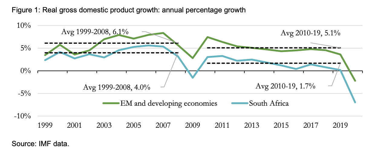
The big picture is clearly bad, but it’s worth noting that even before the financial crisis, South Africa was underperforming on the average global developing country growth rate. After the financial crisis, the country’s position declined, and the gap between SA and the developing world universe got larger.
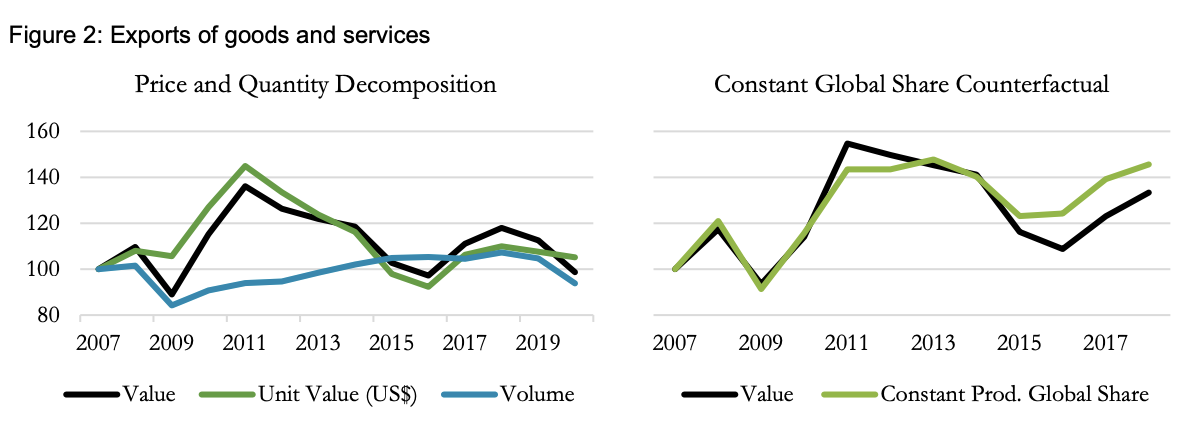
Superficially, the problem was not exports, which were flat in volume and value over the period. But this view is deceptive because relative to the rest of the world, SA was falling behind.
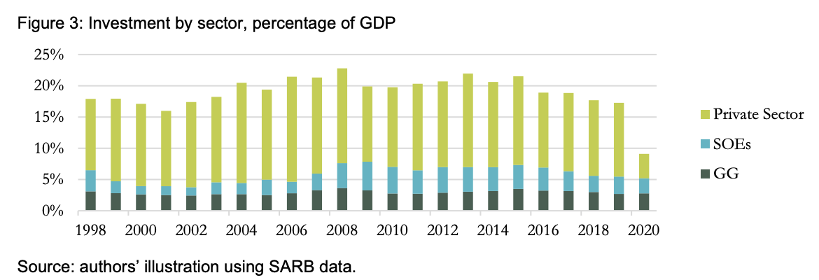
Investment held steady for the first few years after the financial crisis, but then steadily declined.
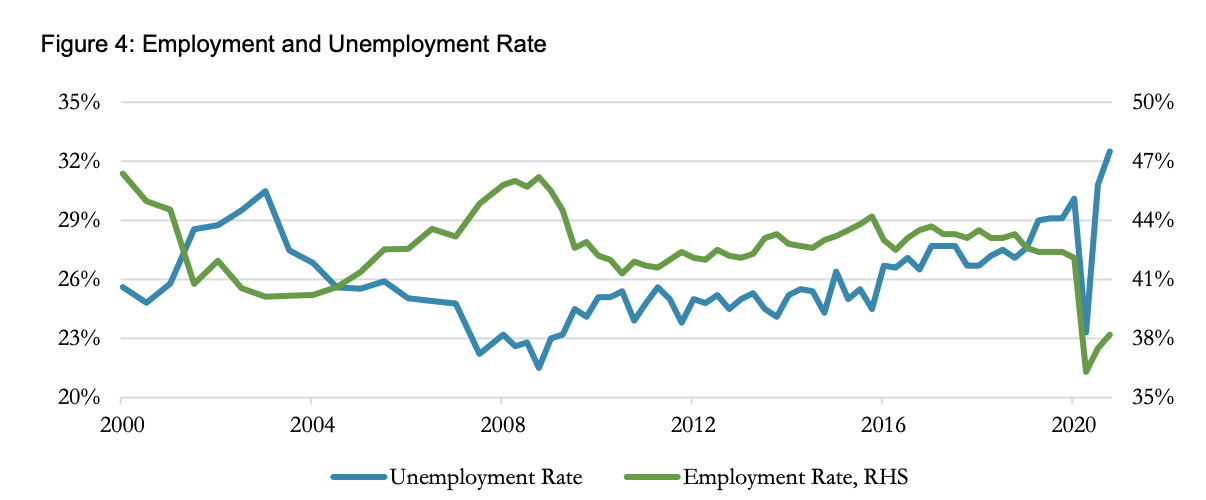
The real shocker was what happened to the unemployment rate and its converse, the employment rate. In its slightly laconic way, the report says: “[South Africa’s] labour market indicators have deteriorated notably in the last decade and are amongst the worst in the world.”
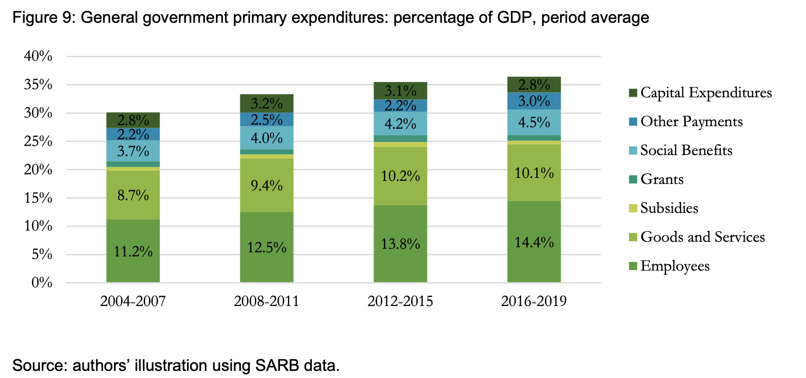
And here is one of the big culprits: the government just continued to spend more and more. But what is worse, even though it was spending more, the investment portion of that expenditure got smaller and smaller. If you want to know why SA’s roads are full of potholes and the traffic lights don’t work, this is where you see it.

And what happens when you spend more than you take in? Your debt increases. And so it turned out in South Africa: the country’s government debt burden rose from just 27% of GDP in 2008 to 62% in 2019, an increase of 35 percentage points in 11 years. It’s now sitting at around R4.2-trillion, and South Africa is spending about R303-billion annually just to service the debt, a little below R1-billion per day — and this, as the research points out, is despite the Treasury frantically pushing the debt out to reduce immediate payments.
How was this money spent? This graph shows how the spending patterns changed over time, with payments for government employees and grants increasing, squeezing out investment spending.
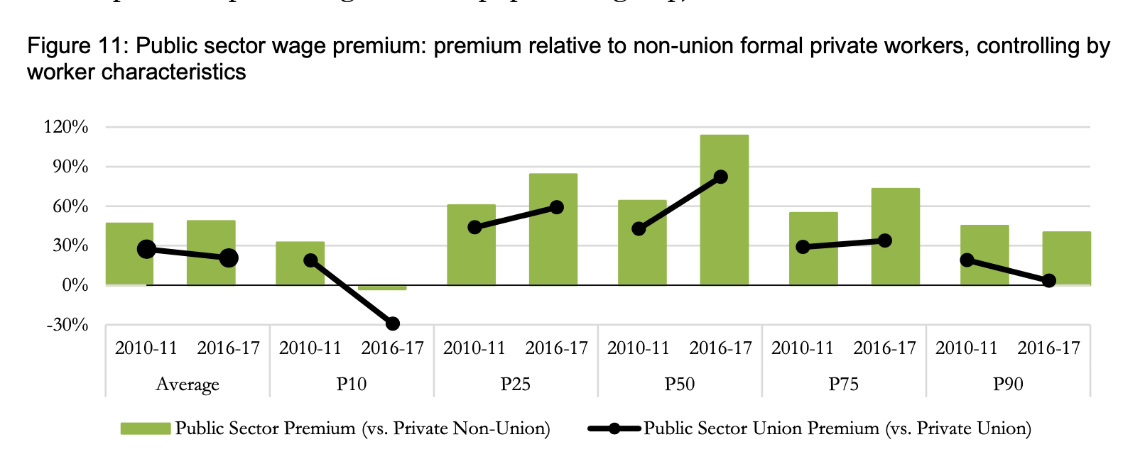
The result is particularly weird — government salaries in all but the lowest and highest categories gradually outpacing private sector salaries, to the extent that now state employees in the 50th percentile get paid 110% more than their private-sector counterparts.
In addition, the total number of employees jumps too, with the result that the total salary bill shoots up by 70%. And who are these new employees? Not teachers and not so much health workers and police — the sectors that really need them — but people employed in the social work, transport, central government administration.

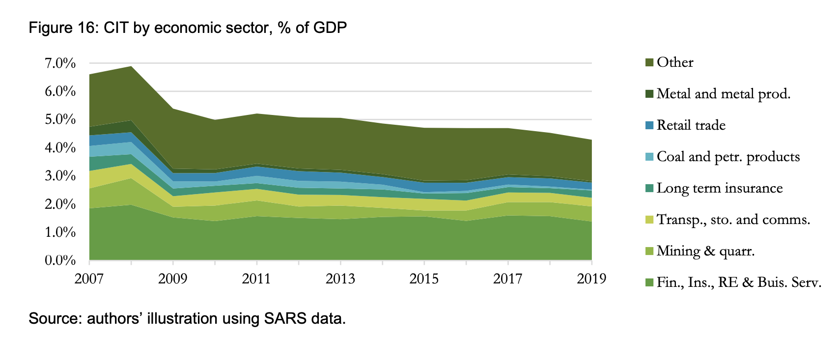
Tax rates stay more or less the same, other than a big increase in VAT in 2018 and personal tax in 2017. But it’s interesting to note that the corporate take, what SARS managed to bring in, slides from 2011. Which sector? All of them.
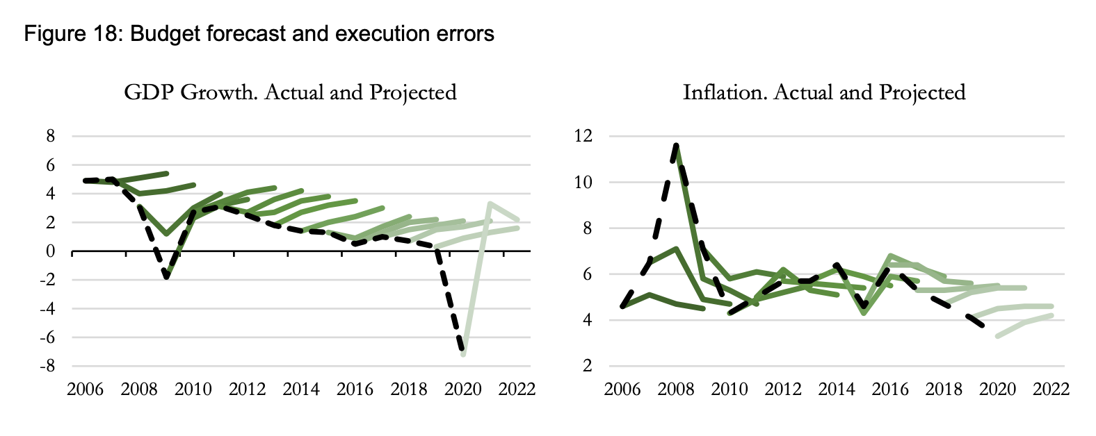
Why did this all happen? One reason is the consistent overestimation of growth and of inflation. This graph is complicated but it shows what the expectations were compared with how things turned out. Every year growth was expected to rise, but instead, it fell.
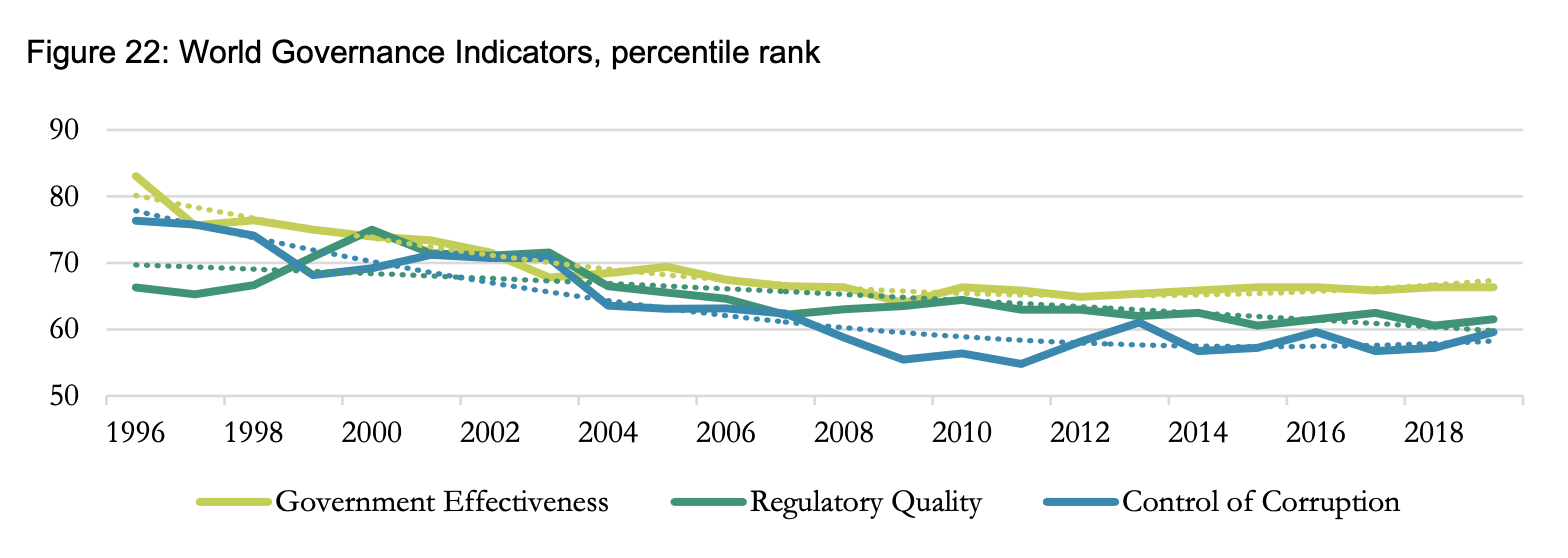
All of this happened during a period when the quality of governance declined. Remember all those promises of a “capable state”? Turns out they were porky pies.
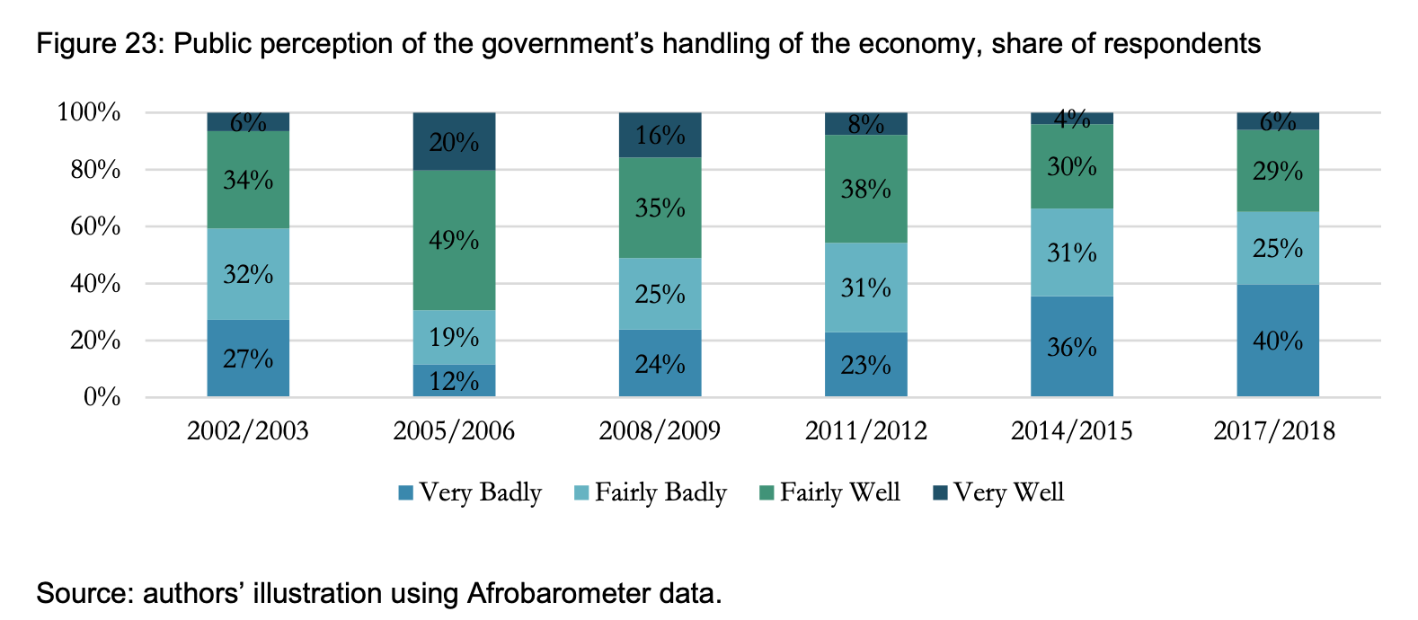
And as night follows day, the public perceptions of governance declined too, but what is remarkable about this graph is by how much. From 2005, the perception that the government was doing “very badly” was confined to just 12% of the population. It is now 40% of the population.
So where does this leave us all on the eve of Ramaphosa’s Sona? Ever since US President Ronald Reagan introduced the phrase “The State of the Union is strong,” in his State of the Union speech, US presidents have repeated it every year. If Ramaphosa were to be honest, he would start by saying, “The state of the union is weak.” The numbers show it. DM/BM
- Article corrected to reflect that the speech on Thursday is President Ramaphosa's sixth, not fifth, SONA.
[hearken id="daily-maverick/9072"]